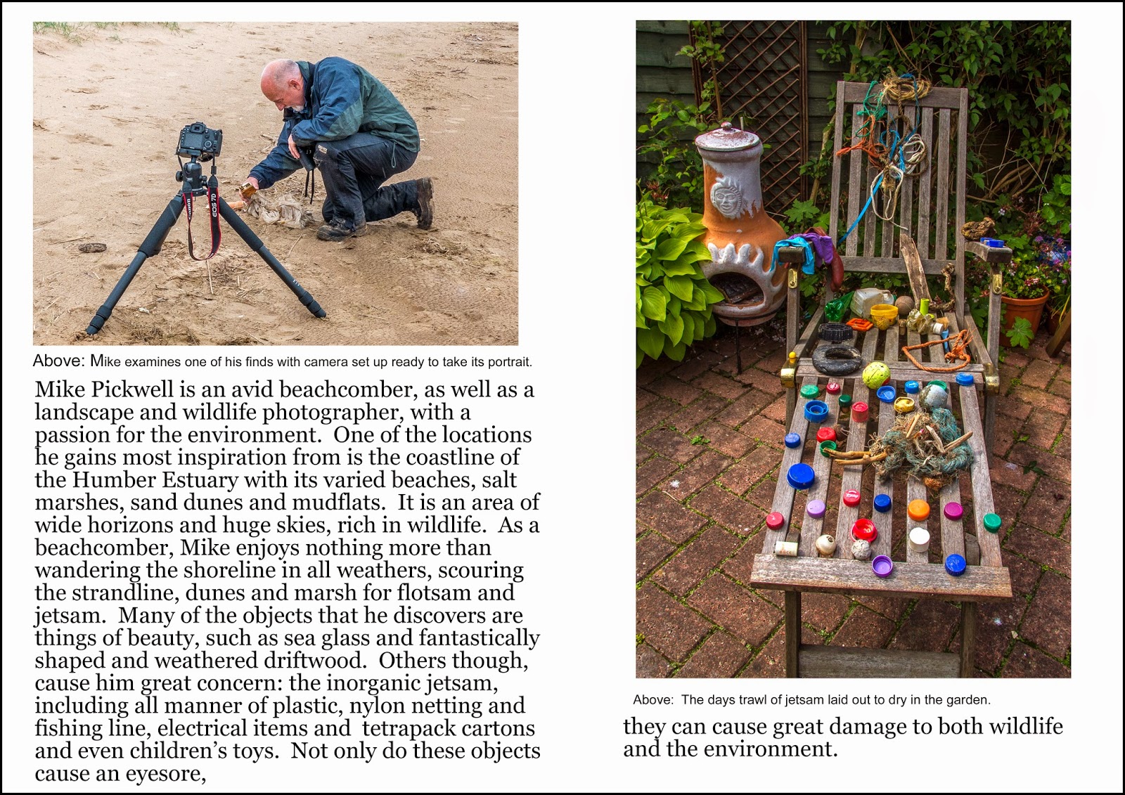
Restrict yourself to the flotsam and jetsam of the estuary and tie it in with beachcombing? You're a beachcomber but instead of old pottery and coins you collect photographs of rubbish. You see the rubbish as a great subject for photography but you're also keen to raise important issues about the environment and have an exhibition of your photographs organised at a local museum. The magazine - lets say it's a serious, glossy nature or culture publication - wants to cover the exhibition and your work. They want some of your exhibition photographs - interesting rubbish aesthetically photographed on appropriate backgrounds (its important that you take them out of their estuary context so that they appear as a collection). They also want a few location shots of you collecting on the estuary. There should be one or two wide angle close ups with rubbish you've just discovered clearly visible - perhaps one with your hand in shot or a portrait closeup with rubbish, and a distance shot of you beachcombing alone to contrast the environmental beauty of the estuary with the overall theme of rubbish. If you have a second camera you could have this in shot. It will start with a double page spread and run over eight pages - a total of eight to ten shots. Delivery as usual via dropbox, files to be 2880 pixels longest side.
To view Images large in order to read the script, please click on a picture.
First my selection of images.
I have chosen these images largely because I think they are my strongest and I also feel that they tell a story.


Before setting out my magazine pages I researched several periodicals: National Geographic, The Guardian Weekend Magazine, Washington post and New York Times. I looked, especially, at how they laid out their images and set out their captions. I again opted to stick with the Sans Serif fonts of Verdana for the title, ariel for the captions and Georgia for the body text as I feel that they work well for me; they are clear and easy to read and give a reasonable variety, whilst at the same time not confusing the reader with too many. The brief asks for a double page spread for the first page and I have opted for full bleed as often used in National Geographic. The layouts were produced in Adobe Photoshop Elements 7 using A3 size documents. My tutor has asked for images to be sent to him at 2880 pixels longest size so I will resize them before Dropboxing them.


No comments:
Post a Comment