Sunday 23 February 2014

Experiments with a 10 Stop 'Big Stopper' Filter.

Thinking towards Assignment 2, I am considering using Hardy's Far From the Madding Crowd for my book cover design and am looking towards an unpalatable  landscape image but I am wanting something out of the ordinary.  To this end I have invested in a 10 stop 'Big Stopper' Filter in order to be able to take some ultra long exposure images.  My first experiments are detailed below.  All are taken with a Canon 7D with either a Sigma 10-20 mm lens or a Canon 17-85. I used f16 for my unfiltered shots as I feel that the lenses perform best at this aperture and give good depth of field.  For the filtered images I used the smallest aperture available in order to obtain the longest exposure.  A tripod was used in all cases.

To view large click on an image.
43sec @ f25
1/40 @ f16
The first of the two images above are with the filter and the second without.  In the long exposure image there is some streaking in the sky but not a lot.  There is movement blur in the reeds.
30 sec @ f25
1/80 sec @ f16
In this pair there is hardly any streaking in the clouds of the long exposure shot but the water has been smoothed compared to the shorter exposure.
30 sec @ f25
1/30 @ f16
Again little evidence of streaking in the clouds in the long exposure shot but the water is smoothed out compared to the shorter exposure.

The above images were taken in the early afternoon with the sun out.  Even with the 10 stop ND filter it was not possible to achieve a long enough exposure to secure more dramatic images.
133 sec @ f22
This image is taken at the same location after the sun had gone behind the large bank of clouds.  Now it was possible to use a much longer exposure to give definite streaking in the sky and smooth the water.  To enhance the moody effect I converted to black and white and cropped to square.
122 sec @ f22
1/25 sec @ f16
These two images were taken at Flamborough Head towards the end of the afternoon with lower light levels which meant that the filter enabled longer exposure times.  The long exposure image shows  much more dramatic streaking in the sky and water is totally smoothed out.
122 sec @ f22
122 sec @ f22
1/25 sec @ f22
Here again there is more dramatic streaking in the sky with the filtered images and the water has been completely smoothed with a slight milkiness.
3 sec @ f8
Here I used the filter to give me a long enough exposure for a handheld ICM shot.

I have found that, in order to get the best out of the filter, it needs to be used either early or late in the day or in dull, gloomy conditions.  I do think, though, that it has great potential and I shall certainly be experimenting with it for Assignment 2 to try and get that 'different' image.

Experiments with Intentional Camera Movement Photography.

 January 2014's 'Reader Gallery' section of Outdoor photography magazine featured Kevin Marston who specialises in Intentional Camera Movement (ICM) photography where he moves the camera during a long exposure.  In the November 2013 edition Lee Frost wrote an article about long exposure pans of seascapes and I actually used one of my own in Assignment 1.  I have long known about ICM shots of trees taken by Pete Cairns of Northshots and again have experimented myself. I even discovered that there is an ICM Flickr group. Thinking towards Assignment 2 where I am considering designing a cover for Thomas Hardy's Far from the Madding Crowd, I want a landscape but am looking for something out of the ordinary; either a straight shot with a dramatic sky, an ICM shot of an ultra long exposure using a 10 stop ND filter.  With this in mind I have experimented with hand held ICM images all with an exposure of about 1 second where I deliberately moved the camera during the exposure.


Reading and Research 08: Saul Leiter.

On Saturday 30th November last year (2013) I was attracted by a photograph that grabbed my interest on the Obituaries page of The Guardian.  It was taken through a misted window with the blurred shapes of two figures and a yellow lorry in the street on the other side.  Part of the mist had been rubbed away as if to aid vision through the misted glass and this more clearly revealed one of the figures on the other side.  It immediately evoked mental images of wet days in steamy cafes with condensation running down the window. It was entitled 'Snow' and was taken by Saul Leiter in 1960.  Leiter had recently died at age 89.

Image 1
The obituary written by Sean O'Hagan, tells us that Leiter was a quiet retiring man who never felt that his work was 'good enough'.  He was a pioneer of colour and was working in that medium ten years before the recognized trailblazers of American colour photography: William Egglestone and Stephen Shore.  He often used out-of-date Kodachrome film in order to achieve the more faded tones that he preferred.  He did work in black and white, though, and Edward Steichen featured his work in the exhibition 'Always the Young Stranger' at the Museum of Modern Art in 1953.  Although he worked in black and white and his work was deemed to be on a par with Richard Avedon, Dianne Arbus, Bruce Davidson, Levitt and Weegee,( though not by him), it is is colour photography of New York that is important.  Although he worked as a fashion photographer until the 1980s, his favoured genre was street photography, often in the East Village neighbourhood of New York where he lived.  He liked to photograph passersby often through, or reflected in misted or dirty windows, giving an abstract feel to them.  One of the reasons Leiter was a gifted photographer was that he never stopped looking at life with a painter's eyes; he actually started out as a painter.  His work is featured in Jane Livingston's book, 'The New York School' and in Martin Harrison's 'Appearances: Fashion Photography since 1945'.  In 1991 his fashion pictures were included in an exhibition at the V&A in London.
I realise that one cannot like all genres of photography or any other art form, but I do not enjoy looking at the ugly and so I empathise with him when he said "I must admit that I am not a member of the ugly school. I have a great regard for certain notions of beauty even though to some it is an old fashioned idea. Some photographers think that by taking pictures of human misery, they are addressing a serious problem. I do not think that misery is more profound than happiness."  (Sire, 2008)
I particularly like the the above photograph (Image 1) and others that Leiter took in a similar vein.  I think they are a different take on street photography and wonder if he was trying to cross the boundary between his photography and his painting.  They certainly have a very abstract feel to them and remind me of Intentional Camera Movement images and ultra long exposures that I have been experimenting with. (see images below).

Reference list
 Sire, Agnes, 2008) Saul Leiter, Steidl Publishers, Gottingen, Germany.

O'Hagan, S,(2013) Saul Leiter: Photographer with a painter's eye for composition and abstraction. Obituaries. Guardian

Davies, L. (2014) Saul Leiter: The anti-celebrity photographer [online]. Telegraph. Available from:
http://www.telegraph.co.uk/culture/photography/10607211/Saul-Leiter-The-anti-celebrity-photographer.html

Wikipedia, (2014) Saul Leiter [online] Wikipedia.  Available from:
http://en.wikipedia.org/wiki/Saul_Leiter

Images
Image 1.  Saul Leiter (1960) Snow [photograph]. [online image]. Available from:
http://atlasphotographic.net/locations/saul-leiter/

Images of my own that remind me of Saul Leiter's misted window abstracts:
In this image the camera was moved laterally during a long exposure.

An ultra long exposure, made possible by the use of a 10 stop ND filter, streaks the sky and smooths out the water.

Tuesday 18 February 2014

Conceptual Cover Design.

In these conceptual book covers the designer and publisher has had to grab the attention of the reading public quickly.  They haven't wanted to use a non conceptual photograph that would be much more explicit, instead, while at the same time wanting to pique our interest, they have wanted to keep us guessing.

This is a provocative collection of essays by prominent women writers about their own marriages - the point at which they decide to to stick it out or end it. They discuss the good times, the bad times and what makes or breaks a marriage.  The image for this cover has either been photographed against a white bckround or cut out in photoshop to allow a simple plain white background for the text.  I like the way that the title is printed over the image and the word OVER is printed pointedly larger than the rest.  The choice of a burnt piece of toast here, I feel, is the conceptual part.  Nobody in the relationship can be bothered to make sure the breakfast toast is cooked correctly.  I think we make an assumption here that it is breakfast toast, making us wonder what happened during the night; perhaps not bad, maybe the toast was burnt because the relationship was good and passionate!!
 This Joyce Johnson's memoir as she is brought up fatherless in an all female household in 1950s New York.  She examines from a woman's perspective, the far reaching reverberations of fartherlessness.  The designer has suggested the m'missingness' of her father with the empty bed - does this also suggest other missing men in her life.  The sheets are rumpled to suggest a body that has just left.  The concept is added to with the missing 'i' which is suggested by the wrinkle in the sheet.  The bed reminds me somewhat of 'My Bed' by Tracey Emin.
 Nova begins with a teenager's suicide in a Northern Virginia small town.  The novel goes on to explore why he committed this act and the author introduces to the story his family, friends, neighbours and even those who barely new him.  We have here an inverted image.  Conceptually, perhaps it represents the boy's final image, a reflection in a puddle.
 Maja was five years old when her black Cuban family emigrated from the Caribbean to London, leaving her with one complete memory: a woman singing - in a voice both eerie and enthralling - at their farewell party. Now, almost twenty years later, Maja herself is a singer, pregnant and haunted by what she calls ‘her Cuba'.  Again another inverted image.  The sky here is used as the clear space to write the text.  Interestingly the author's name is the largest.  Perhaps the designer and publisher wanted to use a well-known auther to sell a new book by here.  Perhaps the image is inverted to reflect the main character's other life in Cuba.

 This book draws on the latest scientific research to demonstrate that our nervous systems are not self-contained: from earliest childhood, our brains actually link with those of the people close to us.....
I like the way that we would expect people to be sitting on the chairs, but it is as if the chairs have a life of their own.  The fact that one is leaning against the other suggests the theory the author is expounding upon.  The ceiling and walls of the room are used as plain uncluttered space for the title.
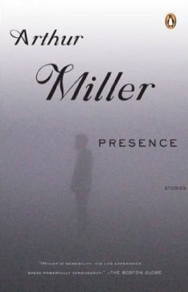
This is a collection of stories by the great american playwright published in 2005, shortly after his death.  The misty background gives plenty of space in which to write the text and perhaps the faint figure suggests the ghostly presence of Miller himself.

Friday 14 February 2014

Photographic Book Covers

We have a large and eclectic collection of books in our house (despite the acquisition of a Kindle a couple of years ago), ranging through fiction, factual, learning and art, and it was fascinating hunting through looking for examples of each of the categories.  I noted that many of our older books had drawings or just text on the cover rather than photographs.  Of the categories listed in the course notes I found the minimalist landscape the easiest to find with still-life clos- up next followed by out of focus photograph.  I found an inverted photograph and historical archival photograph the most difficult.

Out-of-focus photograph

Joe Simpson is a mountaineer of world renown and his book, This Game of Ghosts follows Touching the Void which tells of an expedition to South America where he nearly lost his life.  This Game of Ghosts tells of his rehabilitation after the accident and how he coped with this near death experience.  He also talks fondly of friends who dice with death on a daily basis, many of whom have died in the mountains.  The publishers have chosen as the cover a slightly out-of-focus image of Joe after he and Ian Whittaker had spent  night hanging from ropes on an Alpine climb which nearly took their lives; the fear shows in his eyes.  I think this photograph was chosen to go with the title; the out of focus look portraying how close to a ghost he has come.  There is no photograph on the back cover.
Inverted Photograph
This is the nearest I could come to an inverted photograph, but, being a reflection, it is only half inverted.  Philip Ball is a science writer and Consultant Editor for Nature.  Branches is part of a trilogy on nature's patterns.  This book talks about the patterns in nature and tries to answer the question why those patterns exist; in this instance concentrating on branching patterns.  The publishers have obviously chosen this image as it is of a branch in water with it's inverted reflection.  Part of the cover image also forms the back cover  and this is just the inverted reflection.  It is not a wrap around cover photograph.
Historical archive photograph
Having failed in our own collection of books I found this book in Waterstones bookshop in the history section.  Using contemporary evidence it attempts to get behind the myth of Richard 111 and tell the true story.  The cover photograph is of a contemporary painting and has been cropped to leave negative space at the top for the text.
Another book I found in Waterstones history section, it tells the real story behind Hereward the Wake.  After the Norman Conquest William set about subjugating the people of this country.  Few gave any resistance but one such is Hereward.  The book cover features a complete wrap around photograph of the Bayeux Tapestry showing the link between Hereward and the Norman Conquest.  The image has been cropped to leave negative space at the top for the text.
Still-life close-up
 Rogue Male by Geoffrey Household is a novel in which the hero attempts but fails to assassinate Hitler and subsequently finds himself on the run from Nazi agents. He enters Europe on a hunting trip before the second world war and, therefore, has reason to be carrying a high powered rifle.  It is with this that he attemps the assassination. As part of the story he returns to southern England where he finds refuge in a long forgotten and hidden sunken lane, a hollow way.  On the cover the publishers have used an close-up still-life of a rifle with telescopic sights and an image of Hitler (look alike?) in the background.  A section of blurb on the front connects the two images.  There is no photograph on the back.
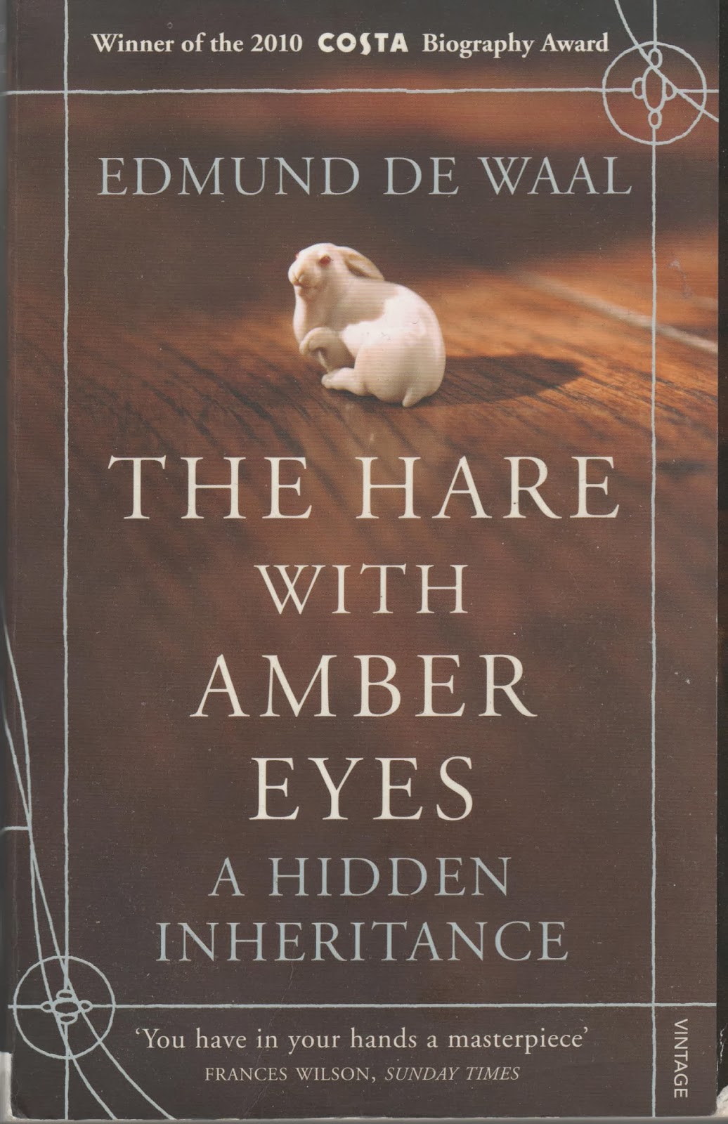
The Hare with Amber Eyes by Edmund De Waal is a biographical account of his family history by tracing the whereabouts of a family heirloom:264 netsuke; Japanese wood and ivory carvings that were used by Japanese men to hold a container of their belongings in place on their belt by tucking the netsuke under their kimono belt.  The story begins in fin de siecle Paris, when the netsuke were collected by Great Grand Uncle Charles Ephrussi and then passed through the hands of various family members in Vienna and Tokyo and finally to Edmund himself.  The family is Jewish and  began as wealthy but self-made traders in wheat in Odessa and then established an empire in Paris and Vienna.  Being Jewish and in Europe during the two world wars their fortunes declined dramatically.  It is a book I couldn't put down and I have sine begun a collection of more modern bone netsuke.  I first was made aware of the story when it and Edmund De Waal were featured on BB2's Imagine programme.  The image of one of the netsuke has been chose to perfectly illustrate the title.
Minimalist landscape
 Peter Robinson is the author of the well-known Inspector Banks detective novels that also feature on television.  This cover is typical of those of the latest Banks novels.  It only appears on the front cover; there is no image on the back.  It is a very minimalist landscape and the misty sky allows plenty of space to write the text without covering important parts of the image.  Apart from the fact that it features countryside typical of that in which Banks lives and works I can see no relevance to the contents of the story.
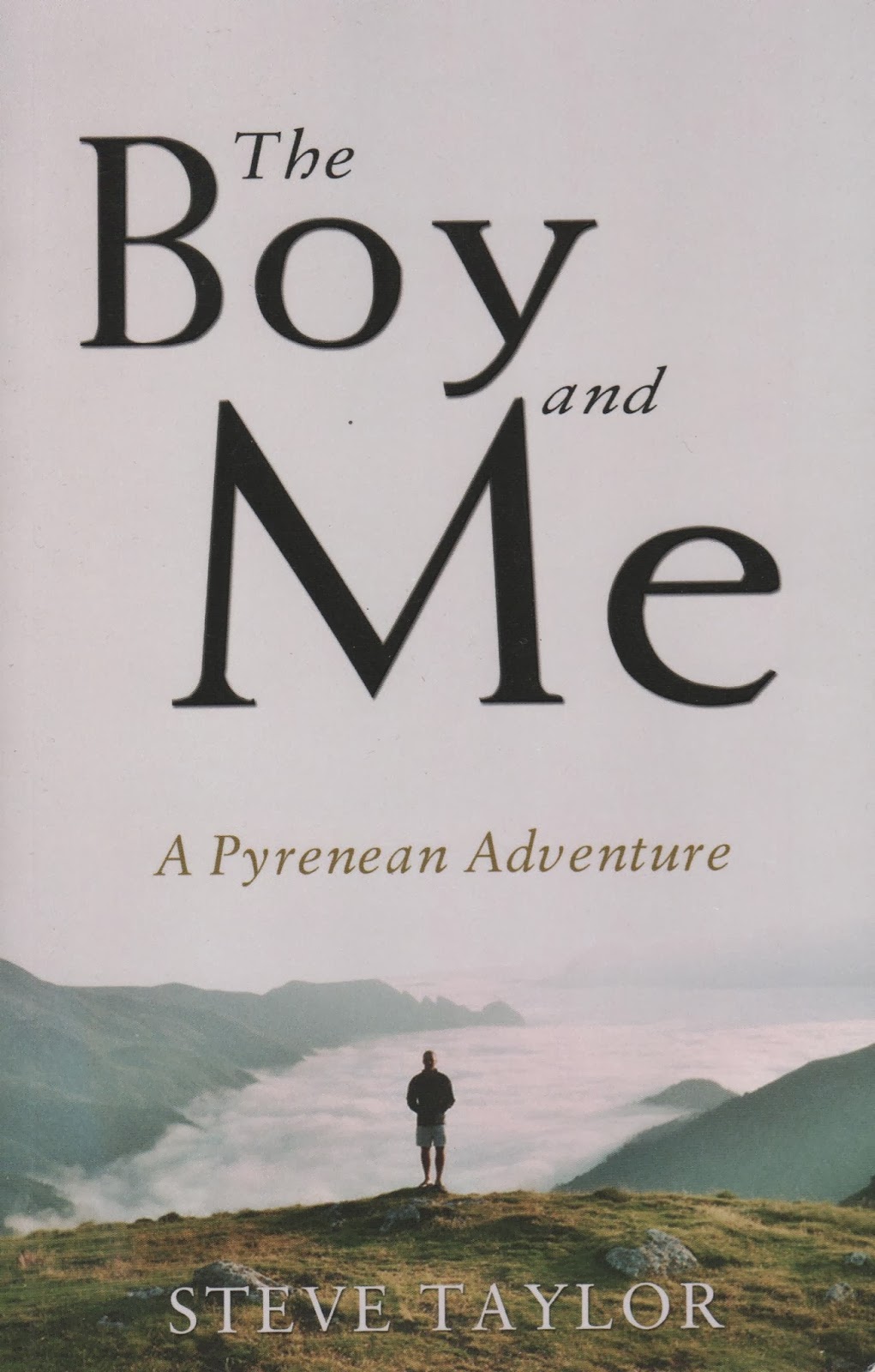
 This book again is a minimalist landscape with a large amount of plain sky to accommodate the text.  In this instance the photograph was taken by the author and features the boy in question.  This is a travel book about a father and son's epic backpacking expedition along the watershed of the Pyrenees from the Atlantic to the Mediterranean.  The image in this case particularly illustrates the book and makes a good cover image from that point of view.  Although not a complete wrap around the photo continues onto the spine of the book.
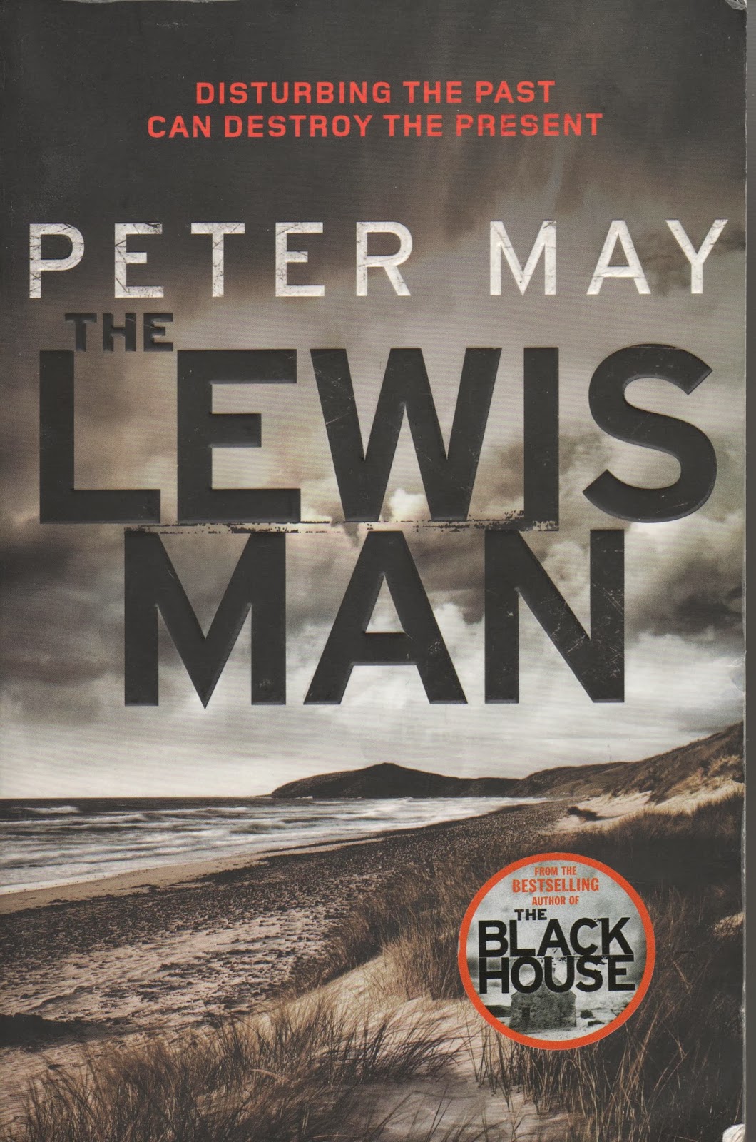
Another minimalist landscape image for this cover and this time being a complete wrap around.  Although it doesn't say so I suspect that the photograph is taken on the island of Lewis.  Lewis Man is a mystery detective story taking place on the island so the cover is particularly appropriate.  Although it doesn't specifically illustrate any particular event in the story, it does show the type of landscape in which the story takes place.  I particularly like this image and the way it has been partially desaturated.

Thursday 13 February 2014

Reading and Research 07: Designer Insights, Niall Benvie; Ourdoor Photography Magazine Issue 176, March 2014

Niall Benvie is a wildlife photographer who writes regularly for Outdoor Photography Magazine.  His article Designer Insights sits well with the section of this course dealing with designing a book cover.  Although the article deals more with images that may be used in magazine articles or to illustrate books, the principle is the same.  He discusses his earlier photography where his one aim was to get as close to a subject as possible and fill the image with it leaving little 'negative space' around it.  He now feels that whether an image is published or not depends more on fitting the criteria of editor and designer.  As a designer and editor, himself, now, for a variety of projects, he often questions why a photographer has framed an image so tightly and not left any room for cropping or including text.  He suggests that horizontal images should be shot rather than vertical as a vertical image will never be used for a double page spread and is only good for a cover, whereas a horizontal image  will fill a double page and can be cropped to vertical for a cover or single page.  I agree with this to a certain extent as I regularly submit images to our local paper to feature in their 'Camera Club' slot.  I now only submit horizontal images as only this format features as 'Picture of the Day' which runs across two pages.  Vertical images are only used as smaller additional club images.  I regularly give talks to groups on my wildlife, landscape and travel photography to groups ranging from church groups, through WI to Wild Life Trust, RSPB groups and camera clubs.  For these I need horizontal images to project onto a screen At these talks I sell greeting cards and for these I need vertical format images so always shoot both formats, especially if I am using my fixed focus 500mm lens and the image would be too close to crop to vertical.  Niall Benvie goes on to say that not only is it better to shoot horizontal but space needs to be left around the image for text and cropping.

I remember Pete Cairns (Northshots) telling us that you should always work a subject until you have everything you want and not to be satisfied with one shot.  Maybe there is a message here: if possible take images in horizontal and vertical formats, tightly cropped images and images with plenty of negative space around so that images for all uses are in the portfolio.

http://niallbenvie.photoshelter.com/

I have selected two images from my protfolio that have plenty of negative space around them for text, for use as double page spreads or for projection.  I have also cropped both to vertical format so they could be used as single page images or cover shots or would be suitable for card production.  Both images were taken on a Canon 7D; the crested tit with a Canon 500mm and the red squirrel with Canon 100-400 at 400mm.

To view large, click on an image.


Project: Choosing Type. Experiment with Layouts.

Again I completed this exercise using Photoshop Elements 7.  I first opened a new document and then dragged in my image and resized it.  Next I added the title using a text box, then the body text and finally the caption.  When I had completed each version I flattened the image, as I had been working in layers, and finally saved it as a JPEG before undoing the flatten image command and working on my next version.
 In this first version I selected Georgia font for the title in bold and at 18pt.  The body text is Arial regular at size 13 and the caption Arial italic at 14 point.  I like this version; the title is large and clear and contrasts with the simple ariel body text and the caption is differentiated by being in italics.
In my second version I kept all of the text the same but moved the image to the left hand side.  In this version the eye is immediately drawn to the image on the right hand side and then has to move from right to left to read the text.  This is counter-intuitive in our culture and for this reason I feel that version 1 is better.
For version 3 I selected a heading font of Kirsten ITC, again at 18pt and regular rather than bold.  The body text is arial italic at 13pt and the caption Arial regular at 14pt. Having the body text and caption the opposite way round doesn't seem to work for me and the Kirsten font doesn't seem very professional.
 Here I have used Bradley Hand font regular for the body text at 13 point with the caption Times New Roman italic at 14pt.  The headiong is Arial regular at 18pt.  I am happy with the heading and the caption but feel the body text is not clear enough; it would perhaps have been better in Bradley Hand bold.
 This version is the same as version 1 but I experimented with a smaller font for the title: 12 point.  I feel that this hasn't worked as the title is not dominant enough.

I next rotated the canvas so that it was in vertical format and placed the image at the bottom.  To do this I had to reduce the size of the image, giving it less impact.  I don't feel this works.
 I kept to the horizontal format for this version but replaced the blue tit with a horizontal format robin.  I feel this works better.
For this final version I rotated the document to the vertical format and replace the robin with the blue tit once more.  This works better if the image is going to be in a vertical format.

Overall I prefer version 1 but I don't think it would work with a horizontal format image, although it would, I think, with a square image.

Wednesday 12 February 2014

Dale Mackie: Blackholes and Supernovas, Abbey Walk Gallery, Grimsby

Abbey Walk Gallery is my local independent gallery in Grimsby.  As well as featuring the work of local artists, artists of such renown as Picasso have been displayed.  Dale Mackie is a graduate in Visual Studies  and he has a studio at the gallery where he produces his work in charcoal and paint.  I have always been an admirer of his work and was recently particularly attracted to an exhibition of his latest body of work, Black Holes and Supernovas, inspired by images taken from the Hubble Telescope.  It is perhaps this which made me even more keen to see the work as I am fascinated by the night sky.  I have often photographed the moon using my 500mm lens, have acceptable images of Jupiter and some of it's moons and have experimented both with starscapes and star trail photography.(See my  Personal Photography Blogs 01 and 02).  I would love to become more involved with astrophotography.  So it was this background that I went along to see Dale's work.  Unlike much of his previous work which is of local scenes and of people at work on the docks, steelworks and at Whitby, Black Holes and Supernovas are abstracts; his first for 8 years.  They are all very large canvasses and are in bright colours with, often, geometric shapes.  With the interest I have in astrophotography and Dale's paintings it makes me wonder about experimenting with some abstract photography, perhaps using some of the effects in photoshop or by using the technique of Intentional Camera Movement.

http://www.dalemackie.com/

http://www.abbeywalkgallery.com/

Some examples of my ICM photography. To view large, click on an image.