
Tuesday 29 April 2014
Experiment with a Paperweight.
Today I experimented with photographing a paperweight. I have seen images of refractions in water drops which have fascinated me (I intend to have a go sometime) and one of our paperweights has globules of glass inside it which I thought could be interesting. I set the paperweight up in the garden with a potted azalea behind it and took some images. I think it makes a colourful abstract image with plentiful reflections and refractions.
Monday 28 April 2014
Project 11: Making a Page Layout.
The idea with this exercise is to use a selection of my own images on a single theme or subject and then turn them into a picture story using the suggested (or another) layout for a four page article. It is suggested that it should be done in Photoshop on four horizontal A3 documents, one of each page. Having looked at the links for Brian Brake's Monsoon picture story and the Day in the Life of a Country Doctor by W. Eugene Smith and others in hard copy and online ( National Geographic, The Guardian, The Washington Post and New York Times) and studied the suggested layouts, I feel ready to start. I have also looked at the fonts used in different publications and have opted to stick with the Sans-Serif fonts of Verdana for the headings and Ariel for the captions but use the Serif Georgia for the text as I have successfully used this before. For the subject I used images from a mountain walking trip that I had made last February to the Snowdonia National Park. These were all on one subject and I felt that they would make a suitable selection for a themed photo essay. I preferred to use my own writing for the body text, rather than Lorem Ipsum.
In order that the captions can be read clearly, please click on an image to view them large.
 Here I have used one very large, strong image with a smaller contrasting one to set the tone for the story. Captions are under the images and I have left enough space to use for body text setting the scene and describing Day 1.
 For my second page to go with the body text describing the next day's adventures I have used a selection of smaller images working together.

A grouping of four images working together here with body text describing the final day of the trip.
 One final full bleed image as used a great deal by National Geographic to finish the story, with a fairly lengthy caption overlayed, which explains Where, What and Whey. In all of my captions I have used the Ws and in one or two cases found an opportunity to utilise the more difficult Why.
A very enjoyable exercise. I found it both useful and interesting to look for images that hang together as well as being strong images on their own. Using suitable fonts was quite challenging and I have learned yet something new in Photoshop to help smooth the way.
In order that the captions can be read clearly, please click on an image to view them large.
A very enjoyable exercise. I found it both useful and interesting to look for images that hang together as well as being strong images on their own. Using suitable fonts was quite challenging and I have learned yet something new in Photoshop to help smooth the way.
More Experiments with The Big Stopper.
I have been waiting for the tides to be right at Cleethorpes to experiment with my 10 stop ND filter for long exposure work. I wanted high tide to coincide with sunrise which it did this morning, although there was no sunrise as such as there was 100% cloud cover. I was happy though to do black and white conversions and crop to square format to make the most of the conditions. Using the ND filter I was able to use 100 ISO and f16 and still obtain 240 sec exposures to smooth out the water. The filter I use is a Hitech one and is fairly neutral with perhaps a slightly blue cast.
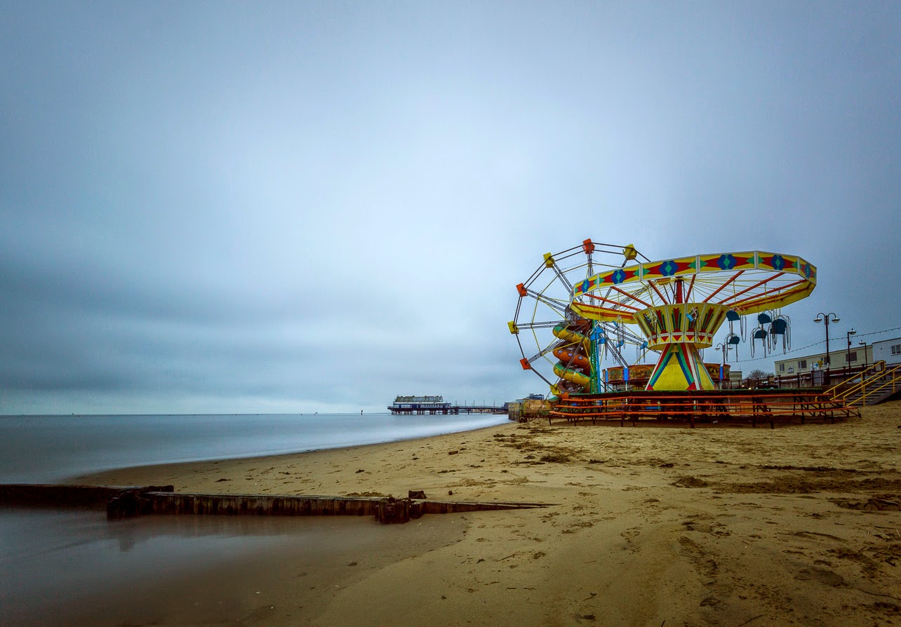 I decided to leave this shot as a colour image. I like the smoothness of the water and the pier behind the rides, but, to my mind, it lacks some impact.
 This image and the one below are of the tide coming in around this old groyne. I decide to crop the colour shot, above, to 16:9 and also cooled it down slightly to enhance the blue feel of an early cloudy morning.
 For this, second, version, I cropped to square and converted the photograph to black and white. I prefer this to the first version.


 Again two versions of the same image with the black and white one cropped to 1:1 which I prefer.
 I didn't use the colour version of this shot as I didn't like it at all, but this is my favourite image of the set. I really like the minimalist feel to it. To enhance this I cloned out three small buoys that distracted the eye from the line leading along the groyne to the maker post.
 Again I didn't like the colour version of this at all so I cropped to square format and made a black and white conversion.
I like the way the 'Big Stopper' filter allows ultra-long exposures which removes any movement in the water to leave a silky smooth look. In all the black and white conversions I used the radial filter in Lightroom 5 to produce a vignette effect. I think that black and white and square format suits this style of image and am happy with these pictures.
For these two shots of the pier with the remains of a groyne in the foreground I left one as colour and also did a black and white conversion. I left both as 4:3 aspect ratio. I quite like both, but again prefer the black and white.
I like the way the 'Big Stopper' filter allows ultra-long exposures which removes any movement in the water to leave a silky smooth look. In all the black and white conversions I used the radial filter in Lightroom 5 to produce a vignette effect. I think that black and white and square format suits this style of image and am happy with these pictures.
Saturday 26 April 2014
Project 10: Practise Writing Captions
For this exercise I looked at captions in The New York Times, Guardian and The Washington Post. Common to all was the fact that the caption was more than one or two words and often a sentence or two. The captions were always placed beneath the photograph, although that isn't always the case in all publications, and the text covers the width of the image and is aligned to the left.
The Washington Post
 This is a very brief caption. It answers the Who and the Where but without the story we wouldn't know in this Why or When.

The Guardian
 This one explains What and Where but doesn't tell us Why.
 Here we are told Who, Where and Why.
The New York Times

 Here the caption explains What, Where and partially Why.
To sum up then all captions tell us Who or What and, usually Where, but we are not always told When or Why.
Captions for Some of My Own Images.
In each case I have attempted to answer as many of the 5 Ws as possible without giving unnecessary information.
 In this picture my caption explains What the photograph is of and Where it was taken. The When is implicit and unnecessary information.
 This caption here explains the What, Where, When and Why.
 Here I have provided the What, Where and When.
 In this photograph I have explained What, Where and When.
 Here the caption tells What, Where and also When.
 Again What, Where, When and possible Why.
 What, Where and When.
The Washington Post
In this instance the caption tells us What, Where and Why.
The New York Times
This caption explains What and Where only.
To sum up then all captions tell us Who or What and, usually Where, but we are not always told When or Why.
Captions for Some of My Own Images.
In each case I have attempted to answer as many of the 5 Ws as possible without giving unnecessary information.
Friday 25 April 2014
Gill Hobson: Lightlines, Abbeywalk Gallery, Grimsby.
I went to see this inspirational exhibition at the wonderful Abbey Walk Gallery, Grimsby. Lightlines is a two part exhibition featuring photographs and a light installation, also featuring the images. Gill's inspiration is her own home and the interplay of light within it's spaces. She has taken over 500 images in her house and a selection of these form the photographic part of the exhibition. Gill doesn't admit to being a photographer and her previous work is in glass sculptures. In fact she took the pictures using a basic compact camera but has manipulated them in Photoshop. They look somewhat like old-style colour negatives, but with an overall blue cast. They have a dream-like or ghostly quality to them, enhanced by the fact that there are no people in any of them. They are framed in a mixed collection of frames that she has collected over a period of time, the linking quality being that they have all been sprayed white, are mounted on white and hung on a white background. Gill says that the work is about making the familiar seem strange. She likens them to Atget's images of Paris Streets, which, also, largely lack people.
The second part of the exhibition is a light installation using many of the 5000 images that she has taken and processed. They are projected via three projectors onto the walls of a completely white room. The images from the projectors are reflected off mirrors onto walls and frames or through lined perspex cubes to produce yet more light effects. The whole is an absolutely fascinating spectacle and is accompanied by an eerie vocal soundtrack which adds to the thought-provoking other-worldliness of the exhibition.
Images
1. Hobson, G. (2014) Lightstain 3 [photograph] [online image] Available from: http://nicktriplow.blogspot.co.uk/2014/03/disturbing-universe-gill-hobson.html [Accessed 25.4.14]
2. Hobson, G. (2014) Lightstain 9 [photograph] [online image] Available from: http://nicktriplow.blogspot.co.uk/2014/03/disturbing-universe-gill-hobson.html [Accessed 25.4.14]
 |
| 1 |
 |
| 2 |
The second part of the exhibition is a light installation using many of the 5000 images that she has taken and processed. They are projected via three projectors onto the walls of a completely white room. The images from the projectors are reflected off mirrors onto walls and frames or through lined perspex cubes to produce yet more light effects. The whole is an absolutely fascinating spectacle and is accompanied by an eerie vocal soundtrack which adds to the thought-provoking other-worldliness of the exhibition.
Images
1. Hobson, G. (2014) Lightstain 3 [photograph] [online image] Available from: http://nicktriplow.blogspot.co.uk/2014/03/disturbing-universe-gill-hobson.html [Accessed 25.4.14]
2. Hobson, G. (2014) Lightstain 9 [photograph] [online image] Available from: http://nicktriplow.blogspot.co.uk/2014/03/disturbing-universe-gill-hobson.html [Accessed 25.4.14]
Roberta McGrath: Re-reading Edward Weston; Feminism, Photography and Psychoanalysis. From Course Reader, Liz Wells.
Roberta McGrath lectures on photography theory and criticism at Napier University, Edinburgh. Previous publications include Seeing Her Sex: Medical Archives and the female body (2002).
In this essay Roberta McGrath begins by introducing Edward Weston as a photographer who emerged from the earlier Pictorialist era into the new Modernist era of photographer. She says that he is unusual in that his work has been dominated by his own writing. She then immediately moves on to talk at length about feminist issues in the art world, suggesting that men cannot possibly view art (the female form) without sexual connotations. She doesn't mention how women view the male form, perhaps they are better at maintaining a dispassionate eye than men! She also moves on to discuss Marxism and feminism before eventually coming back to Edward Weston. When describing photography itself she says that 'taking' a photograph has sexual connotations and suggests that the verb 'to take' is slang for carnal knowledge. I think she is referring here to Weston's photography of nudes but surely every person who has a camera and 'takes' a photography does not have a sexual predatory intent upon the subject. She next goes on to say that the camera itself can become an object of love and a fetish, again with reference to Weston, bu,t I feel, including all male photographers. There follows a discussion on castration and she infers that Weston fears the loss of his camera as much as castration. She links photography to voyeurism and fetishism. McGrath goes on to talk about the Group f64. This group included not only Edward Weston, but also photographers such as Ansel Adams, Imogen Cunningham and Willard Van-dyke, and they believed that photographs should be sharp from the nearest foreground to the far distance and this could be achieved by using the smallest aperture at the time, :f64. To get the most out of these sharp negatives they felt that they should be printed on smooth glossy paper. McGrath latches onto both of these principles and ascribes to them sexual meaning, again with particular reference to Edward Weston, but not, noticeably, Imogen Cunningham.
I chose to read this essay after having read the earlier on in the course reader by Edward Weston himself on Seeing Photographically. I wonder if I am missing something in it though; it just seems to me to be a feminist tirade on photography and the male attitude to women with particular reference to Edward Weston. Weston was undoubtedly a womaniser but his family certainly saw in him more than that:
He was a complex man. Often portrayed as a philanderer, a consummate Don Juan with a camera, he was much deeper and caring: a respectful son, a caring brother, a loving husband. A doting, proud, and engaging father, the real Edward Weston was a man whose philosophy of life, art, and love were inseparable. His world, often overly egocentric, was one built in passion, enthusiasm, and love. Kim Weston (2014)
Many, many other men have been and, are, womanisers but are not photographers and many, many photographers are neither womanisers nor men so I fail to see the connection between feminism, predatory men (because I am sure this is how McGrath sees Weston) and photography. Surely not all males with a smart phone or digital compact are womanisers, voyeurs or fetishists.
Reference
Weston, K (2014) Edward Weston-The Lover-Tina Modotti and Charis Wilson [online]. Weston Photography. Available from: http://www.kimweston.com/edward-weston/edward-weston-the-lover-tina-modotti-charis-wilson/ [Accessed 25.4.14]
Images
1. Weston, E. ((1937) Nude, New Mexico, [photograh] [online image] Available from: http://www.mutualart.com/Artwork/Nude--New-Mexico/8E8503E45BCE6EB5 [Accessed 25.4.14]
2. Weston, E. (1930) Pepper No. 30. [Photograph] [online image]. Available from: http://artdurkee.blogspot.co.uk/2009/12/edward-weston-philosophy-of-photography.html [Accessed 25.4.14]
In this essay Roberta McGrath begins by introducing Edward Weston as a photographer who emerged from the earlier Pictorialist era into the new Modernist era of photographer. She says that he is unusual in that his work has been dominated by his own writing. She then immediately moves on to talk at length about feminist issues in the art world, suggesting that men cannot possibly view art (the female form) without sexual connotations. She doesn't mention how women view the male form, perhaps they are better at maintaining a dispassionate eye than men! She also moves on to discuss Marxism and feminism before eventually coming back to Edward Weston. When describing photography itself she says that 'taking' a photograph has sexual connotations and suggests that the verb 'to take' is slang for carnal knowledge. I think she is referring here to Weston's photography of nudes but surely every person who has a camera and 'takes' a photography does not have a sexual predatory intent upon the subject. She next goes on to say that the camera itself can become an object of love and a fetish, again with reference to Weston, bu,t I feel, including all male photographers. There follows a discussion on castration and she infers that Weston fears the loss of his camera as much as castration. She links photography to voyeurism and fetishism. McGrath goes on to talk about the Group f64. This group included not only Edward Weston, but also photographers such as Ansel Adams, Imogen Cunningham and Willard Van-dyke, and they believed that photographs should be sharp from the nearest foreground to the far distance and this could be achieved by using the smallest aperture at the time, :f64. To get the most out of these sharp negatives they felt that they should be printed on smooth glossy paper. McGrath latches onto both of these principles and ascribes to them sexual meaning, again with particular reference to Edward Weston, but not, noticeably, Imogen Cunningham.
I chose to read this essay after having read the earlier on in the course reader by Edward Weston himself on Seeing Photographically. I wonder if I am missing something in it though; it just seems to me to be a feminist tirade on photography and the male attitude to women with particular reference to Edward Weston. Weston was undoubtedly a womaniser but his family certainly saw in him more than that:
He was a complex man. Often portrayed as a philanderer, a consummate Don Juan with a camera, he was much deeper and caring: a respectful son, a caring brother, a loving husband. A doting, proud, and engaging father, the real Edward Weston was a man whose philosophy of life, art, and love were inseparable. His world, often overly egocentric, was one built in passion, enthusiasm, and love. Kim Weston (2014)
Many, many other men have been and, are, womanisers but are not photographers and many, many photographers are neither womanisers nor men so I fail to see the connection between feminism, predatory men (because I am sure this is how McGrath sees Weston) and photography. Surely not all males with a smart phone or digital compact are womanisers, voyeurs or fetishists.
 |
| 1 |
 |
| 2 |
Weston, K (2014) Edward Weston-The Lover-Tina Modotti and Charis Wilson [online]. Weston Photography. Available from: http://www.kimweston.com/edward-weston/edward-weston-the-lover-tina-modotti-charis-wilson/ [Accessed 25.4.14]
Images
1. Weston, E. ((1937) Nude, New Mexico, [photograh] [online image] Available from: http://www.mutualart.com/Artwork/Nude--New-Mexico/8E8503E45BCE6EB5 [Accessed 25.4.14]
2. Weston, E. (1930) Pepper No. 30. [Photograph] [online image]. Available from: http://artdurkee.blogspot.co.uk/2009/12/edward-weston-philosophy-of-photography.html [Accessed 25.4.14]
Tuesday 22 April 2014
Project 9: Two Images on the Same Page.
For this exercise it was necessary to choose pairs of images that share the same subject but differ in treatment (e.g. in scale, viewpoint, focal length, lighting etc.). The pairs of images have to be sized and positioned in such a way that they appear to fit comfortably. They do not necessarily have to be the same size. They should be produced in either an A4 or A5 Photoshop document.
First find the images.


I have selected the above images as they show a variation in treatment: differences in scale, format, viewpoint and focal length. I now need to combine them in Photoshop:
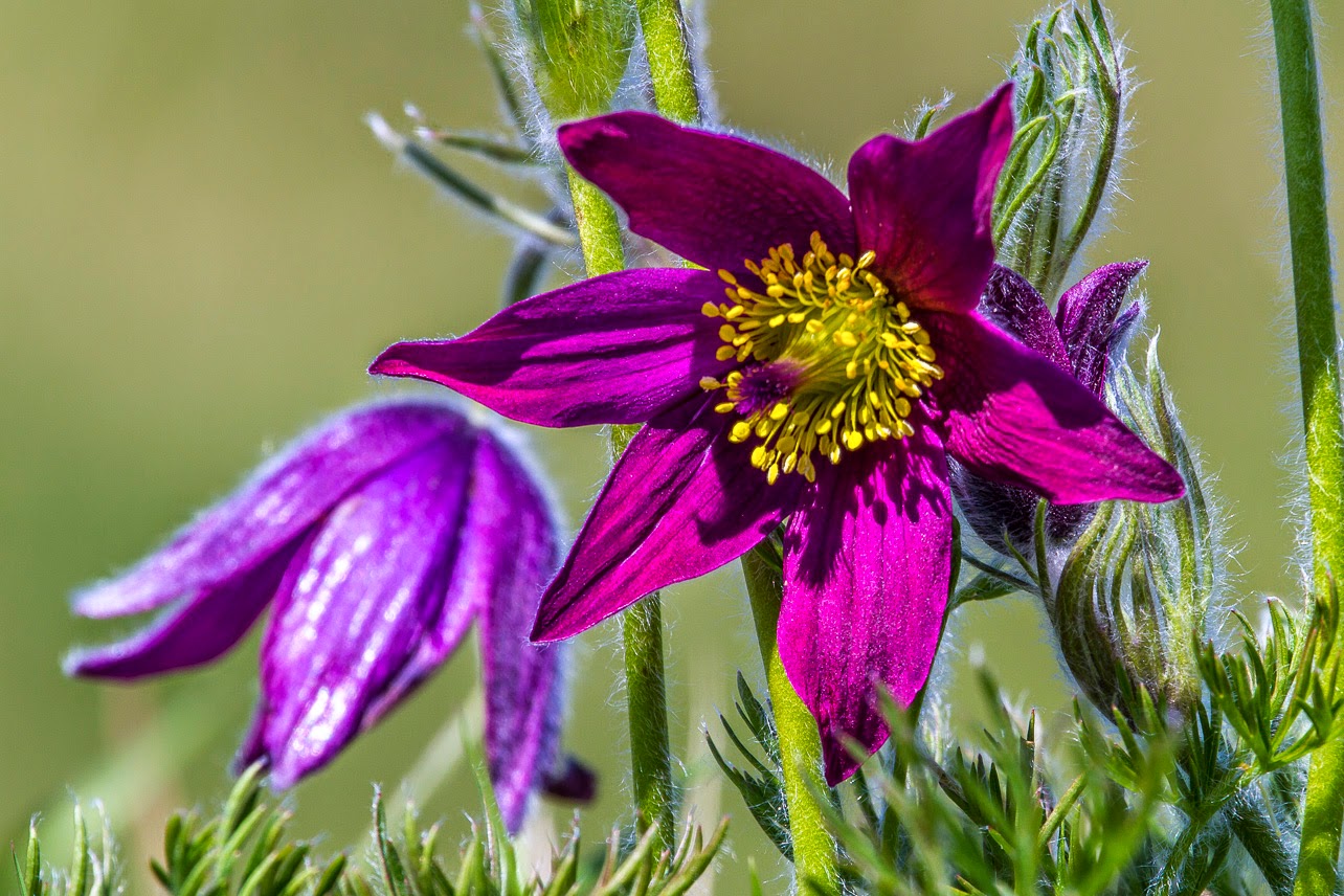
The first pair of images are of a Pasque Flower taken in the Lincolnshire Wolds and only the first time I have seen this plant in the wild in this country. I envisage them being used in a wildlife magazine. On image is in vertical format of the whole plant. The second is horizontal and I have moved in closer to the plant to focus attention on the bottow two flowers which are in pristine condition. Both shots were taken with a 100-400 lens and a 20mm extension tube to throw the background out of focus. I have chosen these two images as they show the whole plant and the detail of one pristine flower.
I envisage these images being used in a magazine along with body text and captions. The first page is similar to those I have seen in the Guardian Saturday Supplement where the title page is one large image perhaps overlaid with a caption. The smaller image would be on the second page and allow for body text. On Page 2 I have used smaller images and given plenty of room for text. I don't feel this gives the images enough impact, however. Page 3 gives the pictures more impact and room for text and would be OK for the middle part of a feature; neither has more impact. I like Page 4; the images have been connected together but there is room only for captions, which would be fine if it were part of a larger spread and there was space for a double page spread of images only. If I have to go for a hierarchy it would be page 1, followed by Page 4, 3 and finally 2.
In the next set I have used two photographs that I took of the Druids Stone Circle in the Welsh Mountains above Llandudno. One is a wide angle shot of the whole circle in landscape format giving an overall view of the setting, the second a vertical format close-up of one of the standing stones in detail.
Both National Geographic and The British Journal of Photography use horizontal format images that cross over onto a second page as I have done with Page 1. I have overlapped the second, smaller, vertical close-up to provide a physical connection between the images whilst still leaving room for captions and body text. For Page 2 I have expanded the horizontal image to make it a full bleed and overlaid the smaller image on top. I have placed it over the sky to avoid obscuring the detail of the stones, but I am not sure that it works. It would be a title page and also need Text on top. Pages 3 and 4 have the images separate and in differing positions, both to allow for body text and captions. My preference is for Page 4, 1,3,2.
In the next set I have used two images from Ynys Landdwyn, an island off Anglesy. One a wide angle black and white shot in horizontal format the second a vertical format also wide angle but in colour and a slightly different point of view. They illustrate different aspects of the island.
For Page 1 I tried the full bleed shot again using the horizontal image and overlaid the colour shot on top. This time I think it works better as the smaller image doesn't obscure any important details. There would again need to be text on this but probably the sky could be used or maybe the bottom right hand corner. For Page 2 I have again used a double page spread but made the images the same depth giving plenty of room for body text underneath. Pages 3 and 4 are variations on the same idea, both giving plenty of room for body text and captions.
Next I have used two horizontal format images of the Forth Rail Bridge. One is zoomed in more that the other and they are from different view points. They are linked by the theme of sailing.
I have experimented with two layouts here, both of which give plenty of room for body text and captions. I think that both would work either for a feature on the leisure use of the Forth or on the bridge itself.
Taken on the same evening as the last pictures but this time somewhat later at sunset and of the road rather than the rail bridge. I wanted both an image showing the bridge so one is wide angle, but I also wanted to make more of the sunset so zoomed in on that whist at the same time incuding enough of the bridge to identify it as such. I have arranged Page 1 so that the wide angle shot has the most impact. It has spread over to the second page and so could be used as part of the title and there are opportunities for overwriting text on it.. I have made the second image smaller and secondary to help illustrate a possible article (travel?)
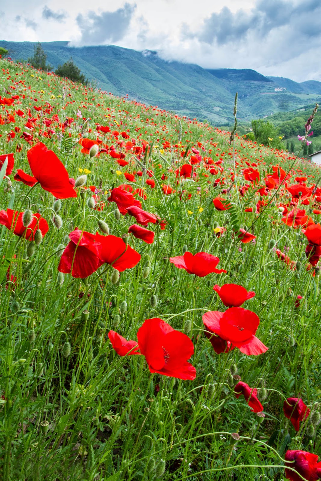
Here I have used two images that I have taken of a field of poppies in Umbria, Italy. On is in vertical format and one horizontal. I have arranged them in two ways so that they could each in turn be used as a title page. Of the two I prefer the layout of Page 1 as I feel that the vertical shot has more impact.
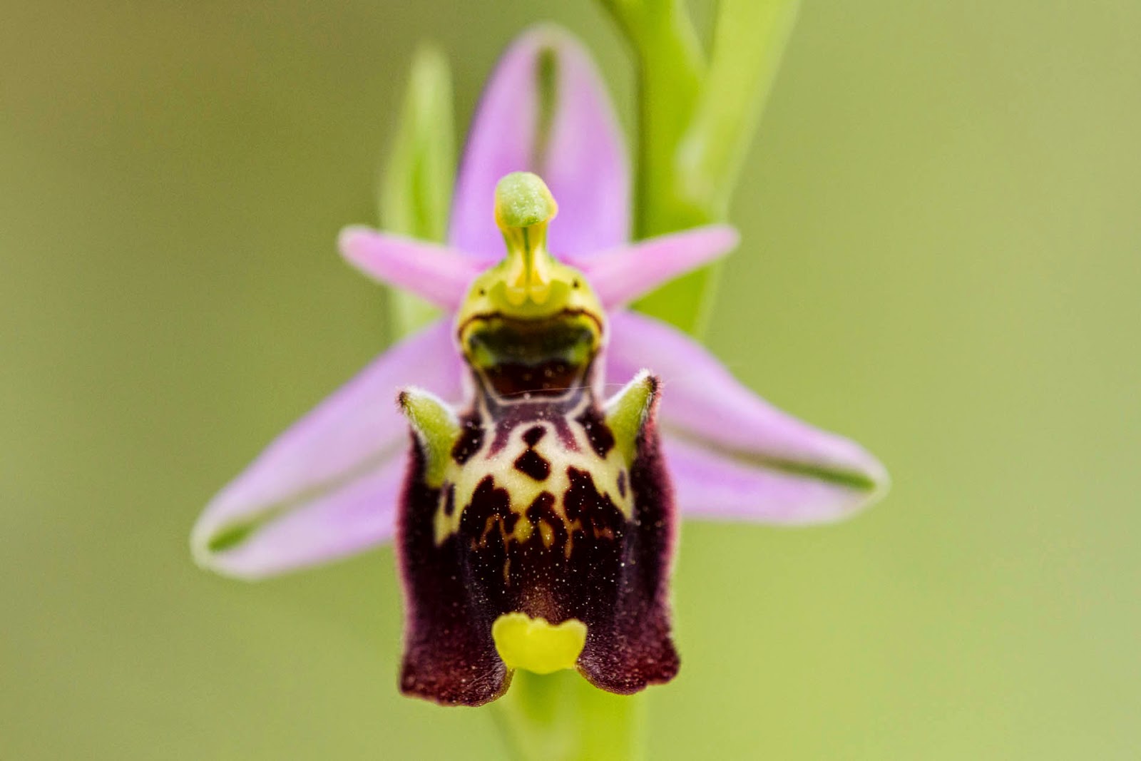
Only one layout this time but I have extended the brief slightly to include three images. They are all of a woodcock orchid, also taken in Umbria last Spring. I have included one wider view showing, not the whole plant but enough to give an impression of it. I have then moved in closer to home in on just one flower and taken one from the side and one from the front. In this way I hoped to provide a full picture of the plant. In each case I have used a Sigma 150mm macro lens to allow me to get in close and also to throw the background completely out of focus to get rid of any distractions. I also used a tripod to avoid problems of camera shake.

First find the images.
I have selected the above images as they show a variation in treatment: differences in scale, format, viewpoint and focal length. I now need to combine them in Photoshop:
The first pair of images are of a Pasque Flower taken in the Lincolnshire Wolds and only the first time I have seen this plant in the wild in this country. I envisage them being used in a wildlife magazine. On image is in vertical format of the whole plant. The second is horizontal and I have moved in closer to the plant to focus attention on the bottow two flowers which are in pristine condition. Both shots were taken with a 100-400 lens and a 20mm extension tube to throw the background out of focus. I have chosen these two images as they show the whole plant and the detail of one pristine flower.
 |
| Page 1 |
 |
| Page 2 |
 |
| Page 3 |
 |
| Page 4 |
In the next set I have used two photographs that I took of the Druids Stone Circle in the Welsh Mountains above Llandudno. One is a wide angle shot of the whole circle in landscape format giving an overall view of the setting, the second a vertical format close-up of one of the standing stones in detail.
 |
| Page 1 |
 |
| Page 2 |
 |
| Page 3 |
 |
| Page 4 |
In the next set I have used two images from Ynys Landdwyn, an island off Anglesy. One a wide angle black and white shot in horizontal format the second a vertical format also wide angle but in colour and a slightly different point of view. They illustrate different aspects of the island.
 |
| Page 1 |
 |
| Page 2 |
 |
| Page 3 |
 |
| Page 4 |
Next I have used two horizontal format images of the Forth Rail Bridge. One is zoomed in more that the other and they are from different view points. They are linked by the theme of sailing.
 |
| Page 1 |
 |
| Page 2 |
Taken on the same evening as the last pictures but this time somewhat later at sunset and of the road rather than the rail bridge. I wanted both an image showing the bridge so one is wide angle, but I also wanted to make more of the sunset so zoomed in on that whist at the same time incuding enough of the bridge to identify it as such. I have arranged Page 1 so that the wide angle shot has the most impact. It has spread over to the second page and so could be used as part of the title and there are opportunities for overwriting text on it.. I have made the second image smaller and secondary to help illustrate a possible article (travel?)
 |
| Page 1 |
 |
| Page 2 |
 |
| Page 1 |
 |
| Page 2 |
Subscribe to:
Posts (Atom)