For this exercise it was necessary to choose pairs of images that share the same subject but differ in treatment (e.g. in scale, viewpoint, focal length, lighting etc.). The pairs of images have to be sized and positioned in such a way that they appear to fit comfortably. They do not necessarily have to be the same size. They should be produced in either an A4 or A5 Photoshop document.
First find the images.
I have selected the above images as they show a variation in treatment: differences in scale, format, viewpoint and focal length. I now need to combine them in Photoshop:
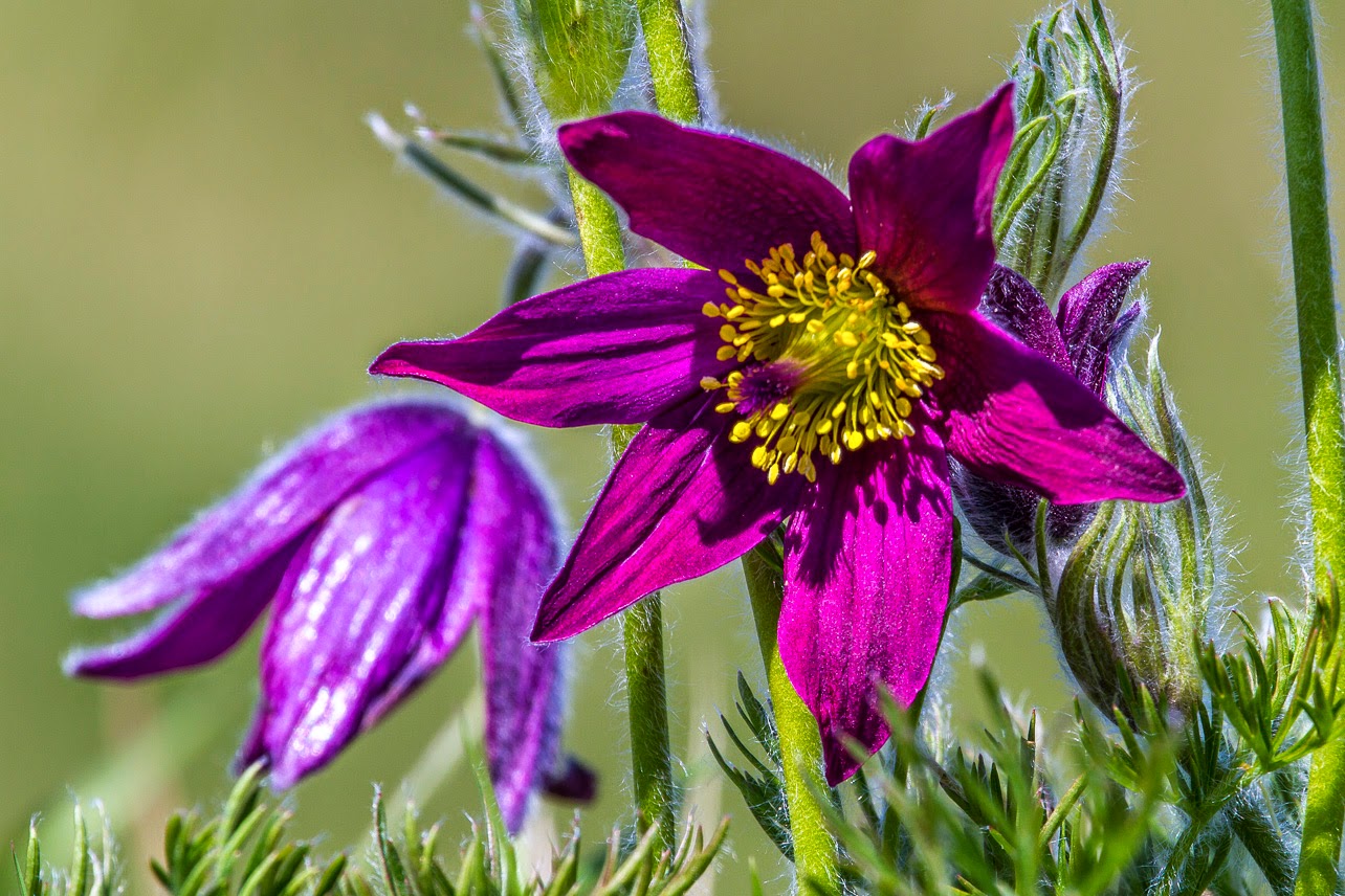
The first pair of images are of a Pasque Flower taken in the Lincolnshire Wolds and only the first time I have seen this plant in the wild in this country. I envisage them being used in a wildlife magazine. On image is in vertical format of the whole plant. The second is horizontal and I have moved in closer to the plant to focus attention on the bottow two flowers which are in pristine condition. Both shots were taken with a 100-400 lens and a 20mm extension tube to throw the background out of focus. I have chosen these two images as they show the whole plant and the detail of one pristine flower.
 |
| Page 1 |
 |
| Page 2 |
 |
| Page 3 |
 |
| Page 4 |
I envisage these images being used in a magazine along with body text and captions. The first page is similar to those I have seen in the Guardian Saturday Supplement where the title page is one large image perhaps overlaid with a caption. The smaller image would be on the second page and allow for body text. On Page 2 I have used smaller images and given plenty of room for text. I don't feel this gives the images enough impact, however. Page 3 gives the pictures more impact and room for text and would be OK for the middle part of a feature; neither has more impact. I like Page 4; the images have been connected together but there is room only for captions, which would be fine if it were part of a larger spread and there was space for a double page spread of images only. If I have to go for a hierarchy it would be page 1, followed by Page 4, 3 and finally 2.
In the next set I have used two photographs that I took of the Druids Stone Circle in the Welsh Mountains above Llandudno. One is a wide angle shot of the whole circle in landscape format giving an overall view of the setting, the second a vertical format close-up of one of the standing stones in detail.
 |
| Page 1 |
 |
| Page 2 |
 |
| Page 3 |
 |
| Page 4 |
Both National Geographic and The British Journal of Photography use horizontal format images that cross over onto a second page as I have done with Page 1. I have overlapped the second, smaller, vertical close-up to provide a physical connection between the images whilst still leaving room for captions and body text. For Page 2 I have expanded the horizontal image to make it a full bleed and overlaid the smaller image on top. I have placed it over the sky to avoid obscuring the detail of the stones, but I am not sure that it works. It would be a title page and also need Text on top. Pages 3 and 4 have the images separate and in differing positions, both to allow for body text and captions. My preference is for Page 4, 1,3,2.
In the next set I have used two images from Ynys Landdwyn, an island off Anglesy. One a wide angle black and white shot in horizontal format the second a vertical format also wide angle but in colour and a slightly different point of view. They illustrate different aspects of the island.
 |
| Page 1 |
 |
| Page 2 |
 |
| Page 3 |
 |
| Page 4 |
For Page 1 I tried the full bleed shot again using the horizontal image and overlaid the colour shot on top. This time I think it works better as the smaller image doesn't obscure any important details. There would again need to be text on this but probably the sky could be used or maybe the bottom right hand corner. For Page 2 I have again used a double page spread but made the images the same depth giving plenty of room for body text underneath. Pages 3 and 4 are variations on the same idea, both giving plenty of room for body text and captions.
Next I have used two horizontal format images of the Forth Rail Bridge. One is zoomed in more that the other and they are from different view points. They are linked by the theme of sailing.
 |
| Page 1 |
 |
| Page 2 |
I have experimented with two layouts here, both of which give plenty of room for body text and captions. I think that both would work either for a feature on the leisure use of the Forth or on the bridge itself.
Taken on the same evening as the last pictures but this time somewhat later at sunset and of the road rather than the rail bridge. I wanted both an image showing the bridge so one is wide angle, but I also wanted to make more of the sunset so zoomed in on that whist at the same time incuding enough of the bridge to identify it as such. I have arranged Page 1 so that the wide angle shot has the most impact. It has spread over to the second page and so could be used as part of the title and there are opportunities for overwriting text on it.. I have made the second image smaller and secondary to help illustrate a possible article (travel?)
 |
| Page 1 |
 |
| Page 2 |
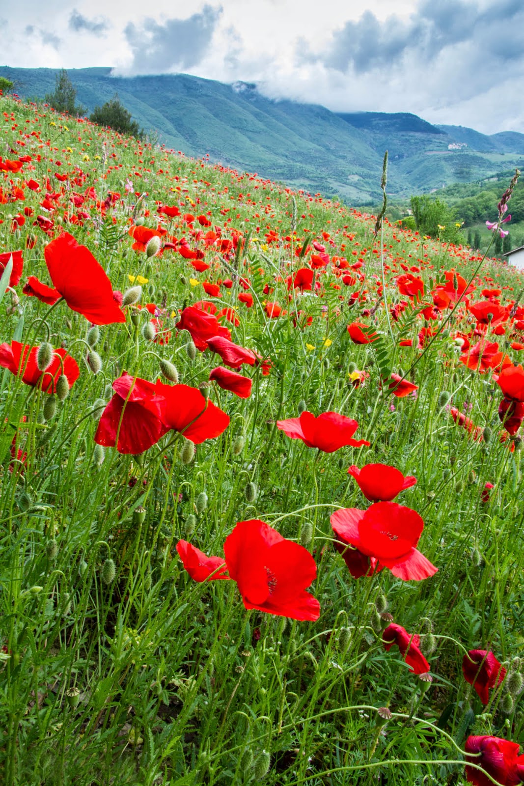
Here I have used two images that I have taken of a field of poppies in Umbria, Italy. On is in vertical format and one horizontal. I have arranged them in two ways so that they could each in turn be used as a title page. Of the two I prefer the layout of Page 1 as I feel that the vertical shot has more impact.
 |
| Page 1 |
 |
| Page 2 |
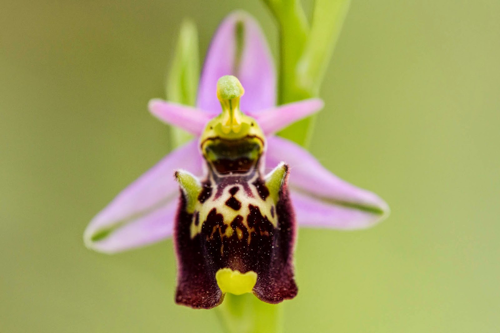
Only one layout this time but I have extended the brief slightly to include three images. They are all of a woodcock orchid, also taken in Umbria last Spring. I have included one wider view showing, not the whole plant but enough to give an impression of it. I have then moved in closer to home in on just one flower and taken one from the side and one from the front. In this way I hoped to provide a full picture of the plant. In each case I have used a Sigma 150mm macro lens to allow me to get in close and also to throw the background completely out of focus to get rid of any distractions. I also used a tripod to avoid problems of camera shake.


No comments:
Post a Comment