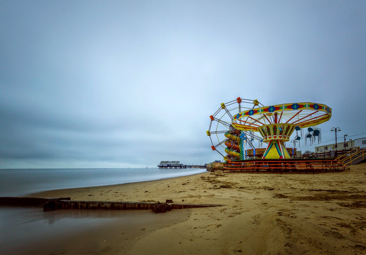
This image and the one below are of the tide coming in around this old groyne. I decide to crop the colour shot, above, to 16:9 and also cooled it down slightly to enhance the blue feel of an early cloudy morning.
For this, second, version, I cropped to square and converted the photograph to black and white. I prefer this to the first version.
For these two shots of the pier with the remains of a groyne in the foreground I left one as colour and also did a black and white conversion. I left both as 4:3 aspect ratio. I quite like both, but again prefer the black and white.
Again two versions of the same image with the black and white one cropped to 1:1 which I prefer.
I didn't use the colour version of this shot as I didn't like it at all, but this is my favourite image of the set. I really like the minimalist feel to it. To enhance this I cloned out three small buoys that distracted the eye from the line leading along the groyne to the maker post.
Again I didn't like the colour version of this at all so I cropped to square format and made a black and white conversion.
I like the way the 'Big Stopper' filter allows ultra-long exposures which removes any movement in the water to leave a silky smooth look. In all the black and white conversions I used the radial filter in Lightroom 5 to produce a vignette effect. I think that black and white and square format suits this style of image and am happy with these pictures.


No comments:
Post a Comment