This Joyce Johnson's memoir as she is brought up fatherless in an all female household in 1950s New York. She examines from a woman's perspective, the far reaching reverberations of fartherlessness. The designer has suggested the m'missingness' of her father with the empty bed - does this also suggest other missing men in her life. The sheets are rumpled to suggest a body that has just left. The concept is added to with the missing 'i' which is suggested by the wrinkle in the sheet. The bed reminds me somewhat of 'My Bed' by Tracey Emin.
Nova begins with a teenager's suicide in a Northern Virginia small town. The novel goes on to explore why he committed this act and the author introduces to the story his family, friends, neighbours and even those who barely new him. We have here an inverted image. Conceptually, perhaps it represents the boy's final image, a reflection in a puddle.
Maja was five years old when her black Cuban family emigrated from the Caribbean to London, leaving her with one complete memory: a woman singing - in a voice both eerie and enthralling - at their farewell party. Now, almost twenty years later, Maja herself is a singer, pregnant and haunted by what she calls ‘her Cuba'. Again another inverted image. The sky here is used as the clear space to write the text. Interestingly the author's name is the largest. Perhaps the designer and publisher wanted to use a well-known auther to sell a new book by here. Perhaps the image is inverted to reflect the main character's other life in Cuba.
I like the way that we would expect people to be sitting on the chairs, but it is as if the chairs have a life of their own. The fact that one is leaning against the other suggests the theory the author is expounding upon. The ceiling and walls of the room are used as plain uncluttered space for the title.
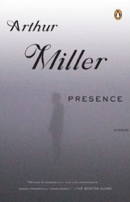
This is a collection of stories by the great american playwright published in 2005, shortly after his death. The misty background gives plenty of space in which to write the text and perhaps the faint figure suggests the ghostly presence of Miller himself.


No comments:
Post a Comment