Sunday, 16 March 2014

More Experiments With ICM.

After coming across the work of two photographers recently I have been motivated to experiment again with Intentional Camera Movement Photography.  In his article in 'Outdoor Photography' (April 2014)  wildlife photographer David Lloyd says that difficult lighting conditions lead him to try his hand a panning long exposures not realising the impact it would have on his creative approach to future work.  It began when he came across a leopard in Kenya's Masai Mara at dusk when the light was too low for a conventional image.  Instead, he says, he moved the camera like a brush across the scene.  He found that it wasn't just shutter speed that was the crucial factor, aperture, distance from subject and the speed of the subject also played a part.  He discovered that a patch of colour in the scene could be smeared across the image like paint.  He says that he has now become addicted to photographic 'painting' and quotes Paul Cezanne who said 'Painting from nature is not copying the object, it is realising one's sensations'.  Lloyd's images are less abstract than Lee Gilby's below; while still being recognisable as the creatures they are they give a real feeling of movement.

I have also been looking at the work of photographer Lee Gilby who uses various in-camera techniques to re-contextualise scenery and objects to create abstract, almost painting-like images. Techniques include long exposure times, multiple exposures and ICM without the use 'trick' filters and with only basic post-processing. I find his photographs fascinating and beautiful.  Some I can see how he has produced the shot but with others it remains a mystery.  These are excellent photographs - I have a great deal to learn with this technique.  His aim is to evoke the same emotional response in the viewer as he had when taking the image.

Motivated by looking at the work of these two photographers I again attempted my own versions.  All were taken hand held and I moved the camera during a 1-2 second exposure.
A vase of chrysanthemums.  Still recognisable, this shot reminds me of those of  Saul Leiter taken through a misted window.
Another vase of flowers, this time less recognisable.
Daffodils
A hanging piece of art work.  Although its basic shape can still be made out it is totally abstract.
This and the two images below are of a bowl of spheres and the tree images each produced different effects.

I am really taken by this technique and feel that it could play a part alongside my more conventional photography and my non-ICM long exposure shots.  The new 10 stop ND filter will give me the ability to use long enough exposures even during the middle of a bright day but I see a real opportunity for this technique with landscapes before sunrise and after sunset and on really dull days.

References

Lloyd, D (2014) Painting With Cameras, Outdoor Photography, (177) p. 73
Gilby, L. (2012) Lee Gilby Photography [online]. Available from: http://www.leegilby.com/

Friday, 14 March 2014

Assignment 2: A Photographic Book Cover; Final Submission.

After a lot of thought I have finally made my decision on which image to submit for this assignment.  All my initial designs, thought processes and research are on previous blogs.

To view large, click on an image

Final Choice

Far From the Madding Crowd

Alternatives

Far From The Madding Crowd

Fahrenheit 451


Thursday, 13 March 2014

Tamas Dezso: No Country for Young Men; British Journal of Photography.

The photographs in this BJP article by Colin Pantall are by Hungarian photographer Tamas Dezso who is based in Budapest and born in 1978. His website tells us that he is a fine art documentary photographer working on long-term projects focusing on the margins of society in Hungary, Romania and other parts of Eastern Europe.  His work has been published in Time, National Geographic and other publications.   I was fascinated by the bleakness of his images of post communist Romania.  I am not normally attracted by photographs of the ugly, but I was drawn to this article, having just completed reading 'Between the Woods and the Water', the second part of a trilogy of books by celebrated war hero and travel writer, Patrick Leigh Fermor, in which he describes walking from The Hook of Holland to Constantinople in 1934 at the age of 18.  In 'Between the Woods and the Water', he walks across Hungary and Romania and describes them evocatively.  Although it would seem he stretched the truth, and, perhaps, wrote about events that may not have happened and visited and stayed with the landed gentry, his descriptions of Romanian life and the countryside evoke a Utopian Victorian England.  Exaggerated or not, his writings describe a place of total contrast to the images of Dezso which are bleak in the extreme.  Leigh Fermor wrote this travelogue in 1986 and was able to remind us, in hindsight, that in the few years after his 1934 walk, this idyllic life and landscape would undergo huge trauma and violence and become unrecognisable.   This is the Romania of Dezso's images, which are part of an ongoing project begun in 2011 entitled: Notes for an Epilogue.  Communism came to an end in Romania in 1989, but its legacy remains.  Full employment under the communist regime came to an end with it, but the source of that employment and enforced industrialisation: factories, mines and power stations are still there, gradually decaying and returning to nature.  These images remind me of the photographs by Jitka Hanslova, which I saw in an exhibition in the National Portrait Gallery in Edinburgh a couple of years ago.  Her photographs in this exhibition also depict life in a post communist world; this time in East Germany and Czech Eastern Bohemia. (My notes on this exhibition are in a previous blog; click the following link. Jitka Hanslova.)  Pantall tells us in his article in BJP  that Notes for an Epilogue is not a piece of simple nostalgia; it depicts a struggle for survival, and a society in which traditional village life was stripped away, only for the industrial, full-employment communism that replaced it to fall.  The question now is simple; how do you make a living in this new world. (Pantall, 2014)  The photographs show us both the decaying buildings: a sodium factory, a flooded village, a railway station, and also people stripping these buildings of metalwork in order to survive and eke out a living.  Some are heart rending, such as the boy wearing a bear skin: The Bear Dancer (Salatruc, East Romania, 2013) and an old lady looking pitifully into a mirror Anastasia (Livada, North West Romania, 2012).
Image 1 Anastasia (Livada North West Romania), 2012  
Image 2 Metal Scrap Collector (Near Hunedoara, West Romania), 2011
Image 3 Bear Dancer (Salatruc, East Romania), 2013
Dezso's early work comprises moody, but very moving social documentary images probably, although his website does not say, in his native Hungary.  His other main body of work, 'Here, Anywhere' began in 2009 and is also ongoing.  This is a similar project, but this time the focus is his native Hungary.  On his website he tells us that his intention is to record the transition from the old communist regime throughout towns, cities and countryside towards, perhaps a more western society.  He feels that his country 'hovers between the eastern and western worlds' (Dezso, 2014).  I find that some of his images in this project are reminiscent of some of Joel Meyerowitz's work in his book 'Tuscany'.  Some examples include Deer (North Hungary, 2011), Bust Stop (North East Hungary, 2011) and Gage Tree (South Hungary, 2011) in that they are landscapes which are muted in tone and colour.  Interestingly, he produces his images in a square format, something I have been doing with my 'Big Stopper' work.  In his biography, it states that he works as a fine art photographer; I wonder if this is the reason.

My comment: 'I am not normally attracted by the ugly' was questioned by my tutor.  It reminded him of a saying by Picasso: 'the ugly may be good; the beautiful never will be'.  He feels that something considered beautiful conforms to a standard taste, whereas something considered as ugly may confront our present sensibility and bring out a new one.  Although, as I have said, I am not normally attracted by the ugly, my favoured photographic genre being wildlife and landscape, through discussion with my tutor I have opted for photographing something which may be considered ugly: flotsam and jetsam on the Humber Estuary for Assignment 3.  I hope to show that, as Picasso suggested, the ugly can be good, if not beautiful.

Reference List

Pantall, C. (2014) No Country For Young Men. British Journal of Photography. 161(7821)pp. 58-69
Dezso, T (2014) Here, Anywhere [online]. Tomas Dezso Photography Website.  Available from:
http://www.tamas-dezso.com/index.php?page=work&id=4

Images

1.  Dezso, T (2012) Anastasia [Photograph] [online image] Artist Website. Available from http://www.tamas-dezso.com/index.php [Accessed 13.03.2014]
2. Dezso, T. (2011) Metal Scrap Collector [Photograph] [online image] Artist Website. Available from http://www.tamas-dezso.com/index.php [Accessed 13.03.2014]
3.  Dezso, T. (2013) The Bear Dancer [Photograph] [online image] Artist Website. Available from http://www.tamas-dezso.com/index.php [Accessed 13.03.2014]

Bibliography

Tamas Dezso Photography  
Jitka Hanslova Photography
Pantall, C. (2014) No Country For Young Men. British Journal of Photography. 161(7821)pp. 58-69
Leigh Fermor, P. (1986) Between the Woods and the Water. London: John Murray; New Edition (2004)

Saturday, 8 March 2014

Assignment 2: A Photographic Book Cover; Fahrenheit 451

Before finally committing myself to any one choice of book or cover, I decided to experiment with another of the titles I had designed:  'Fahrenheit 451' by Ray Bradbury.  This bleak novel is set in a post-literate future where books are banned as being the source of all discord and unhappiness.  Instead of being treasured and valued by society, they are burned.  This would be the theme of my book cover.


  When we had our wood-burning stove lit and it had burned down nicely to glowing logs, I set up the camera and then placed an old pamphlet that we had read on it and photographed it as it burned. I then opened a photoshop document set to the actual size of a paperback book and imported my image.  I wanted this to form the cover background and so resized the image to fill the document, partially desaturated it and applied a gaussian blur to give an impressionist feel to it.  I then re-imported the image, this time cropped to square and with a black border to help it to stand out.  Finally I added the titles and blurb.  I used a mixture of Georgia and Times New Roman and experimented with both black and red font to see which suited the best.


On balance I prefer the second version.  I think that the black stands out better on the title but I found that the red reads more easily for the blurb on the back cover.

Friday, 7 March 2014

Assignment 2: A Photographic Book Cover; Far From The Madding Crowd

Having researched all of the books suggested in the assignment brief read 1984 (many years ago), read Far From the Madding Crowd (again years ago and recently for this assignment) and watched the films of Far from the Madding Crowd and Remains of the Day I settled on Far Far From the Madding Crowd for my assignment image.

Of all the books listed, this is the one that attracts me the most.  I think that I am drawn to this book as I have a rural background and have a passion for the landscape, countryside and the play of light on the land.  Hardy's descriptions of the Victorian countryside are so evocative of my childhood.  Not that I am a Victorian child, but the pace of life in the 1950s was still slower and things were only just beginning to change.  As a young child, I remember going to watch my great grandfather at harvest time working on top of a thrashing machine and I remember stooking sheaves of wheat and barley by hand following the reaper binder.  I worked in land-work gangs performing most farming tasks by hand and, as a child, remember the family pig being kept in the pig sty at the bottom of the garden and the screeching of the pig at the annual pig killing.  I envisaged a landscape image for the cover (perhaps wrap-around), but wanted to move away from a 'chocolate box' rural scene and try for something more creative and experimental.  To this end I have been trying out a new 10 stop ND filter in order to be able to achieve ultra long exposures to create movement in the clouds.  I wanted a moody, atmospheric scene to reflect the tragic nature of the book and planned to increase this effect by converting my image to black and white.  One of my memories of the book (and film) are of sheep farming and I remember one of the most dramatic incidents being the stabbing of a flock of sheep to save their lives, so I hope to find sheep out in the Lincolnshire Wolds , if I could find some in a suitable location.  This, actually, became one of my biggest problems; as well as I know the Wolds, I was surprised at how cropped the land is when it came to finding sheep.  I knew of one nearby sheep farm and started there, but I just couldn't find the view that I wanted; either they were not co-operative or were in a field that  wasn't suitable.  Fortunately, while out walking on the Viking way on the Wolds escarpment looking towards Lincoln.

Conceptualisation
I wanted a photograph for the cover of the book that would reflect both the rural nature of the book and my childhood.  Agricultural life plays a large part in the book, especially sheep farming so I wanted to include this aspect.  As this is a book full of tragedy, I didn't want a chocolate box image taken in bright cheery lighting so deliberately chose a dull gloomy day, used the 10 stop ND filter to the sky to add drama and then converted to a moody black and white image to reflect the book's tragic aspect.

The Design


Capturing and processing the initial image
 I came across the right setting with curious sheep that didn't head for the horizon as soon as I appeared.  Having found them I returned late on a gloomy afternoon hoping for the atmosphere that I envisaged.  Below is my first, straight, image.  There was too much foreground but I knew that I could crop the image to what I wanted.

I then attached the 10 stop filter, changed the camera setting to bulb and took a 3 minute exposure.  The sky looked interesting but I thought that I would need to apply the ND grad feature in Lightroom during post processing.
 As I expected the sheep moved during the shot and the long exposure didn't capture them apart from their faint outlines on the skyline. Having processed both images in Lightroom I then combined them in Photoshop to achieve the image below.
 Once I had an image with sharp sheep and a streaked sky I converted it to black and white, increasing the contrast to produce the image below.
 There was now too much foreground in the picture so I cropped to the image below.
 I knew that I wanted the book cover to be a total wrap around one so I again cropped the picture from the right so that when I made the cover the sky on the front cover would appear to streak from the centre of the cover, rather than from the spine.
Producing the cover.
I measured the dimensions of several paperback books  and decided to apply the proportions of my copy of the novel in a new document in Photoshop at 300 dpi.  Having done this I opened my final cropped image and dragged it into the document.  I had to resize and move the picture to get it in the correct position.  Using the ruler facility I drew two lines to show the position of the spine and then reduced their opacity.  Next came titles and blurb for which I used a mixture of Georgia and Times New Roman font at different sizes.  I chose the muted green to suit the cover and reflect the rural nature of the novel with other colours to pick out other aspects.  I found the penguin logo in google images and used photoshop to erase the white background before placing it on the cover.  Finally I flattened the layers in the document and saved as a high quality JPEG and also as a TIFF file.  The only thing that I don't like about this is the fact that I have part images of two sheep on the spine.
  I experimented with different layouts using this photograph.  Here I cropped the original image yet again and then put the three separate images in different layers which I moved over and behind each other to achieve the cover below.  This meant that I didn't have to draw lines to show the spine as the darker image delineates it.  I am not too sure about the piece of hedge on the spine image though.
For this version I tried an idea that I have seen in other novels, where the photograph only occupies the front of the cover and other imagery occupies the back, or even plain white overlaid by the blurb.  I don't particularly like just white so decided to use my sky enlarged to extend over the back cover and the spine.
Only a few days after working on this cover design I bought 'Mountains of the Mind' by Robert MacFarlane, an author often writing about the landscape and nature and who is seen as the inheritor of a tradition of nature writing that includes the likes of John Muir, Richard Jefferies and Edward Thomas.  His books have won The Guardian First Book Award and also the Boardman/Tasker Award for Mountain Literature.  I was interested to see that the cover design for this book was in the exact format of mine above and I include images below:


In the same way that I treated my cover, the designer here has place a photograph on the cover with space for the writing and for the back and spine has used an enlargement of the snow part of the image to provide a plain but textured surface for the blurb and spine title in the same way that I have used cloud.
What have I learned
Despite finding this assignment difficult to get my head round I have enjoyed both the intellectual and technical challenges it presented.  I have learned a great deal about book covers and found their conceptualisation fascinating.  I have enjoyed attempting to conceptualise my image for this book and also trying to come up with a more creative and experimental shot.  I have learned a great deal about using a 10 stop filter and also about creating Intentional Camera Movement shots.  I have particularly enjoyed extending my photoshop skills; working with layers and combining two images was also a new experience for me, despite producing 'colour-pop' images for fun in the past.

Photographers Who have Inspired Me During the Course of This Assignment
I enjoy the work of many photographers but I have particularly been looking at the exponents of long exposure photography, especially when they work in black and white.  Four names stand out in my mind:  Matej Michalik who is based in Slovakia, Michael Kenna, Andrew Gibson and Pete Bridgewood who is based in Southwell.  Mattej Michalik specialises in black and white long exposure and many of his images have those dramatic skies for which I was seeking for this assignment.  Michael Kenna again works in black and white, usually in square format and regularly uses long exposure.  There is much about the work of these three photographers that reminds me of Ansel Adams.  Pete Bridgewood is a GP based in Southwell and he writes a monthly article for Outdoor Photography.  Not all of his images are black and white but he often uses long exposures to enhance his photography.
http://www.matejmichalik.com/
http://www.michaelkenna.net/index2.php
http://www.andrewsgibson.com/blog/about/
http://www.petebridgwood.com/wp/

Wednesday, 5 March 2014

Assignment 2: A Photographic Book Cover

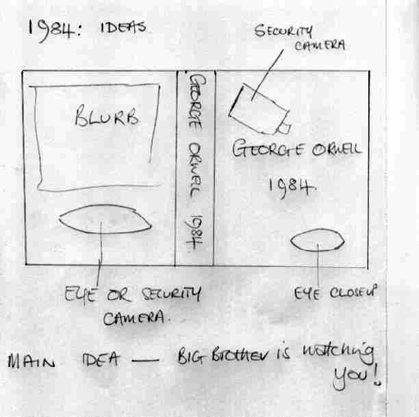
Looking at the list of books, I had read and seen the film of Far From the Madding Crowd, both of which I enjoyed very much.  I was familiar with 1984 and Farenheit 451 from school days and have watch the film of The Remains of the Day.  I was not inspired by any of the other titles having read the blurbs on line.  I am mostly drawn to the Thomas Hardy but also have some potential ideas for 1984 and Farenheit 451.  My sketches and thoughts are illustrated below:-

1984
 For 1984, the theme that springs to mind is: 'Big Brother is Watching You'.  This evoked images of security cameras and an 'eye in the sky'.  To this end I have been out and taken some images of security cameras locally and aim to take a close up of my son's/wife's eye.  These would be positioned on the cover as illustrated.  Although having a preference for wrap around images for covers, I don't think my ideas lend themselves to this technique.  I feel that it is more suited to such as the following books:-

I am not keen, however, on white covers, especially on the back, as in Le Carre and Strange Affair by Peter Robinson; I find these rather cold.

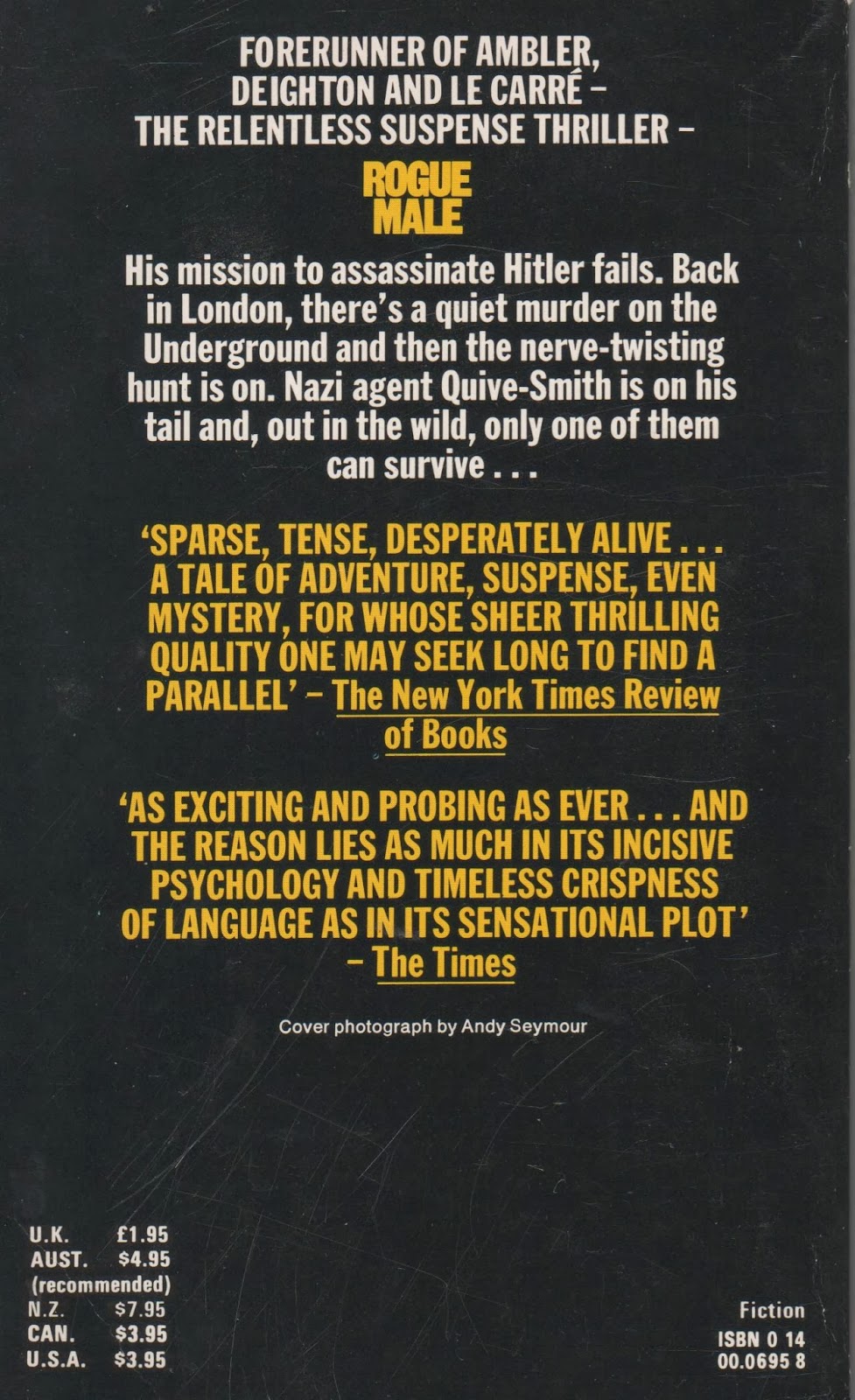
The back of Rogue Male is better but again all black is rather bleak - perhaps what was intended:
1984 is rather bleak, though, so maybe white or black would suit it.  I will give this some thought.

Fahrenheit 451
The main theme of this book that jumps to mind is that of 'burning books'.  I immediately thought of making use of our wood burning stove, here, perhaps with an actual book burning on it. Perhaps an act of sacrilege, so maybe the Guardian media magazine instead which would be used to light the stove anyway.  Here again I feel that the format of the above books would best suit, although, again, I shy away from white for the rest of the cover and may search the internet for a 'fiery' background, maybe with the opacity reduced.
 Far From the Madding Crowd
Of all the books listed, this is the one that attracts me the most.  I think that I am drawn to this book as I have a rural background and have a passion for the landscape, countryside and the play of light on the land.  Hardy's descriptions of the Victorian countryside are so evocative of my childhood.  Not that I am a Victorian child, but the pace of life in the 1950s was still slower and things were only just beginning to change.  As a young child, I remember going to watch my great grandfather at harvest time working on top of a thrashing machine and I remember stooking sheaves of wheat and barley by hand following the reaper binder.  I worked in land-work gangs performing most farming tasks by hand and, as a child, remember the family pig being kept in the pig sty at the bottom of the garden and the screeching of the pig at the annual pig killing.  I envisage a landscape image for the cover (perhaps wrap-around), but would like to move away from a 'chocolate box' rural scene and try for something more creative and experimental.  To this end I have been trying out a new 10 stop ND filter in order to be able to achieve ultra long exposures to create movement in the clouds.  I am thinking of a moody, atmospheric scene to reflect the tragic nature of the book.  One of my memories of the book (and film) are of sheep farming and I remember one of the most dramatic incidents being the stabbing of a flock of sheep to save their lives, so sheep may feature, if I can find some in a suitable location.
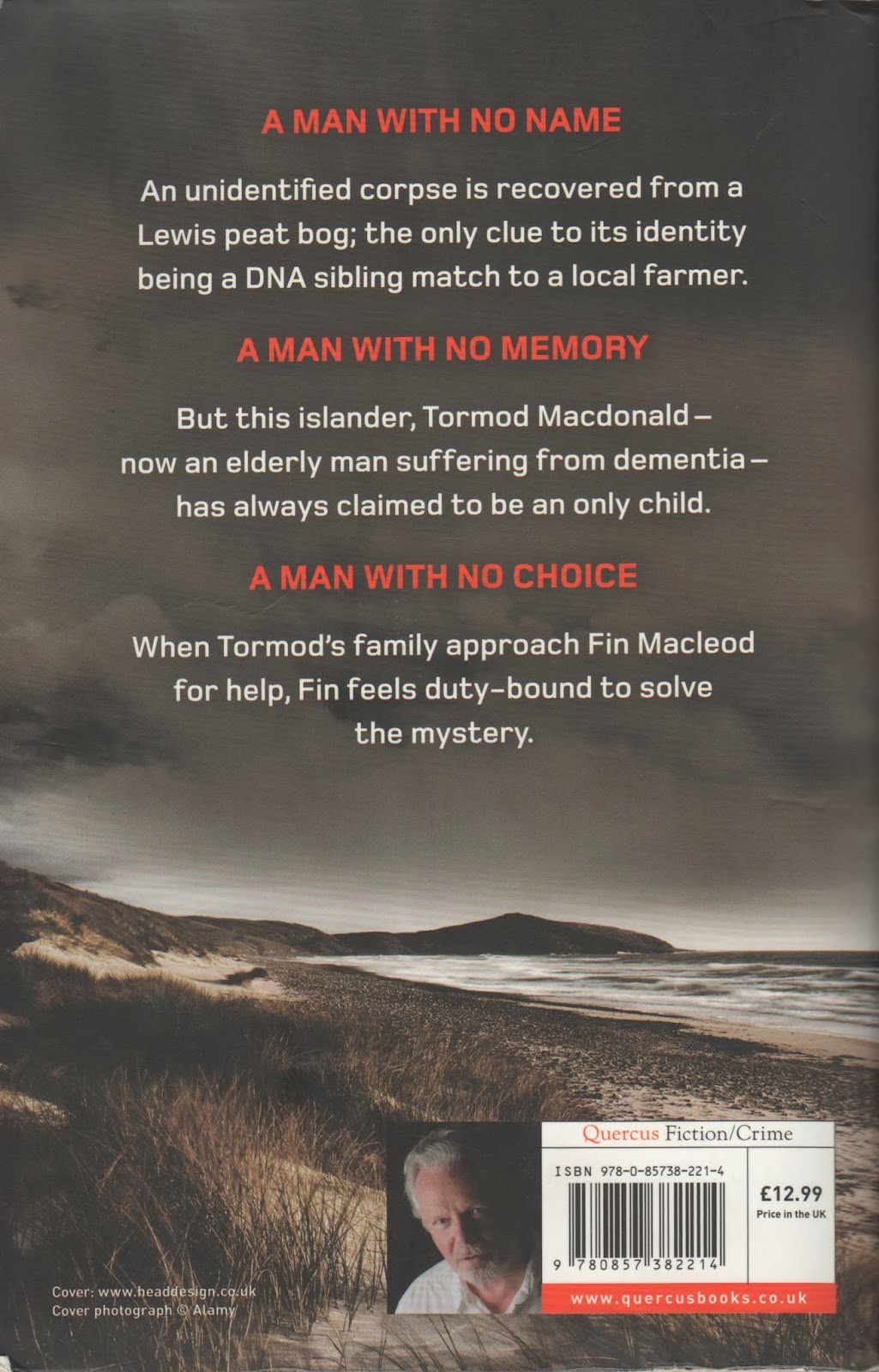
I think this may suit a wrap around image for the cover, using one image or even one image copied and reversed to produce one mirror image as in Lewis Man by Peter May.


Alternatively I may go for one image for the front with a plain back as in Strange affair which has a smaller image of the cover photo on the spine.